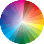
  Color TheoryThe Color WheelA color circle, based on red, yellow and blue, is traditional in the field of art. Sir Isaac Newton developed the first circular diagram of colors in 1666. Since then scientists and artists have studied and designed numerous variations of this concept.
Primary colors – are the 3 pigment colors that can not be mixed or formed by any combination of other colors. All other colors are derived from these 3 hues. red, yellow, blueSecondary Colors – These are the colors formed by mixing the primary colors. green, orange and purpleTertiary Colors – These are the colors formed by mixing a primary and a secondary color. That’s why the hue is a two word name, such as blue-green, red-violet, and yellow-orange. yellow-orange, red-orange, red-purple, blue-purple, blue-green and yellow-green color wheel labeled with types of colors in their proper locationsWarm & Cool Colors
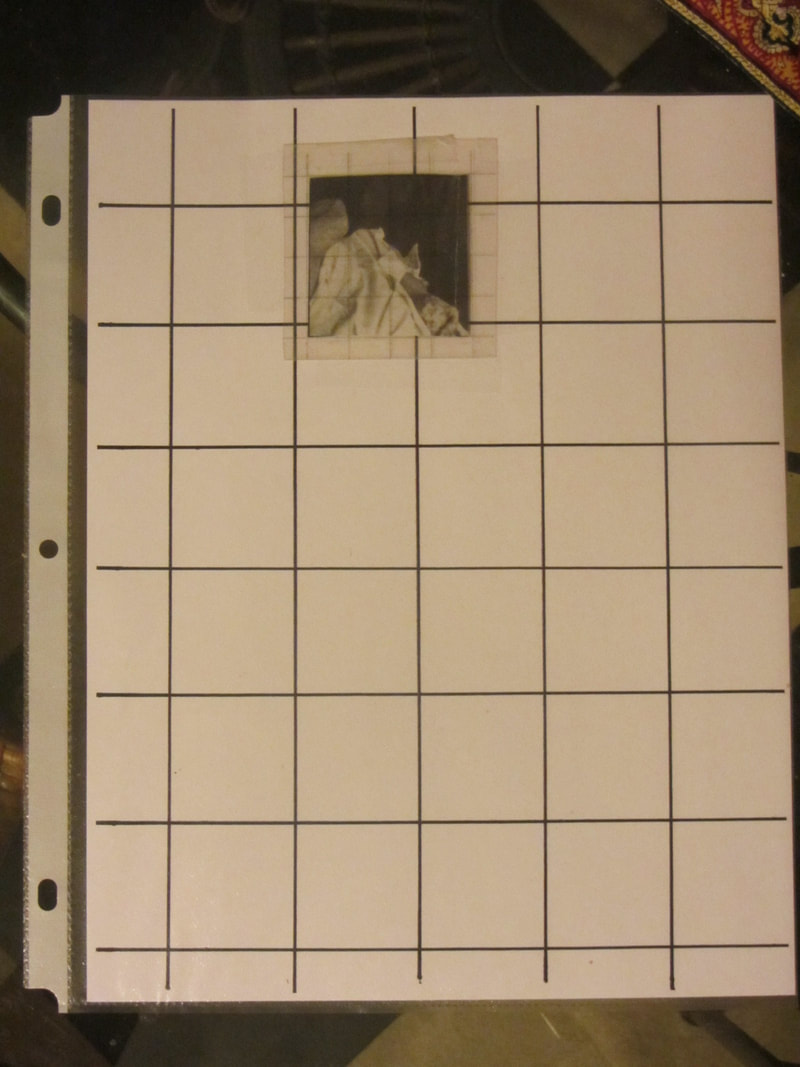
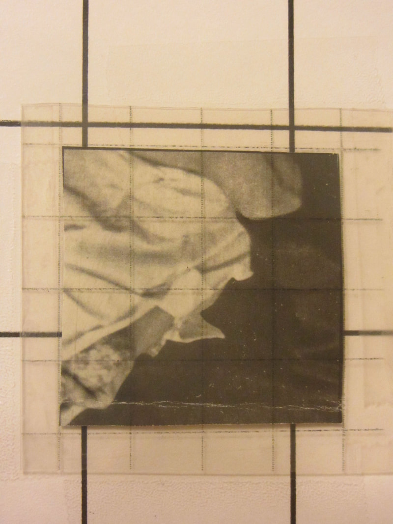
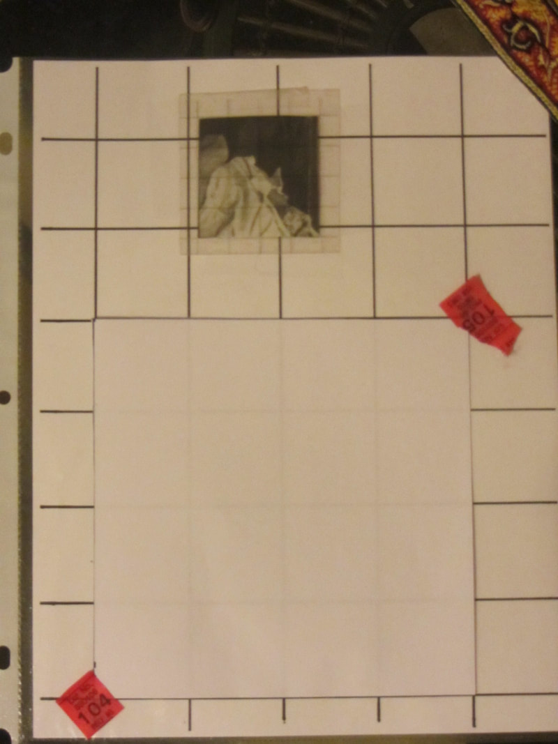
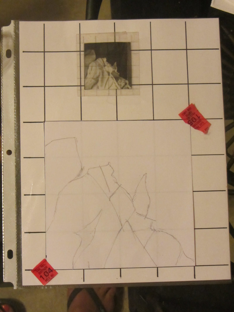
Warm colors advance and cool colors recede, affecting the perception of depth. This theory is based upon that fact that the eye adjusts when focusing on colors of different wavelengths. Red light waves have a longer wavelength than blue ones. An image containing both cool and warm colors would demonstrate contrast of temperature or warm/cool contrast creating more complex relationships between the color (warm colors can read cooler against a higher intensity warm colors and cool colors sometimes can advance against predominately warm palette). In this project, we will be working individually to create a collaborative project. Each artist will be given a 2" square piece of a larger picture of a famous work of art. You will use a grid to enlarge it to 6" copying the elements of lines,shapes,values, textures, and colors as accurately as possible. Then somewhere in that image you will hide your name, not by making it small but by using the elements listed above to disguise your name. Think "optical illusion". Step 1: Place your 2" square in the small grid pocket. It shouldn't matter which direction, but it should line up along the lines of the grid. That way you will have lines that evenly divide the square into 16 equal squares. Step 2 : Next, lay your 6" square over the larger grid below, lining it up along the lines as you did with the small square, and tape two corners. If you can't see the grid through the paper, LIGHTLY trace the lines onto your paper using a ruler. The grid will indicate where to trace. Only do this if you absolutely can't see the lines through the paper! Step 3: Transfer the image to your paper, considering where you might hide your name in the drawing. E.Q. What is it that makes a painted image believable? Representational paintings are actually illusions. Two dimensional interpretations of a three dimensional world. You are about to take up the challenge of creating those illusions. Here we ill work with the image of a lemon as a simple subject to illustrate some basic principles behind the illusion of depth on a 2 dimensional picture plane. On a 9"x12" sheet of WC paper, your will do three drawings of a lemon representing its 1. shape, 2. form and 3. tone using pencil following the instruction in the document below. Also on that page, you will paint two depictions of a lemon using watercolor to capture its light and shade from 4. overhead light source and 5. a low angle of light. Finally on a half sheet of WC paper (6" x 9") you will paint the final lemon either from life, or from a photograph capturing its highlights, reflected light, and color following the instructions on the second page of instructions. You should be able to define the following vocabulary from the instruction sheet... l ocal color reflected color modeling tone cast shadow form reflected light highlights tone shape form
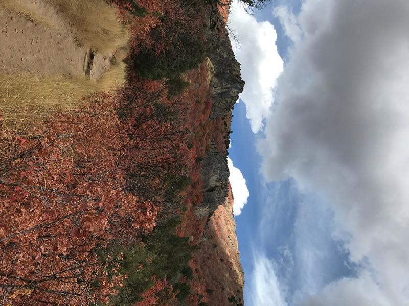
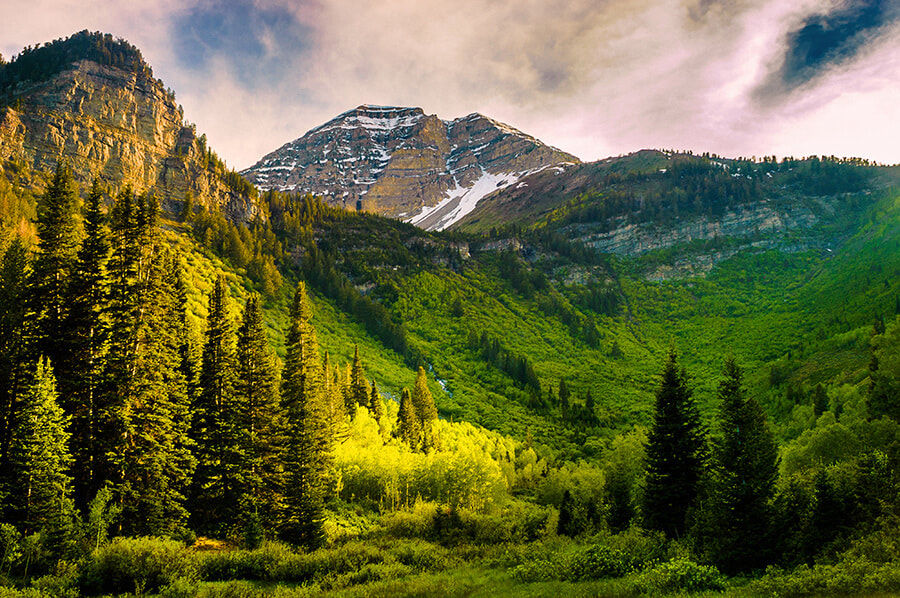
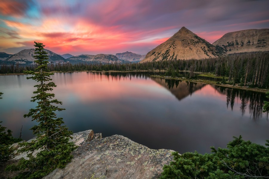
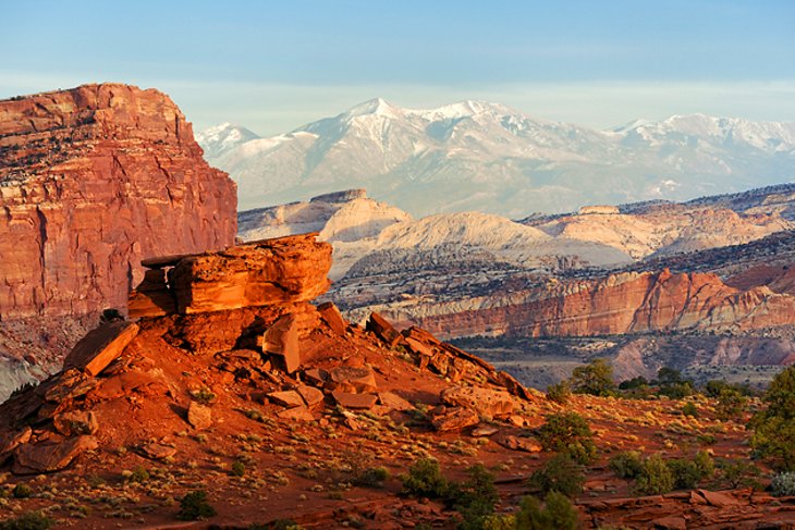
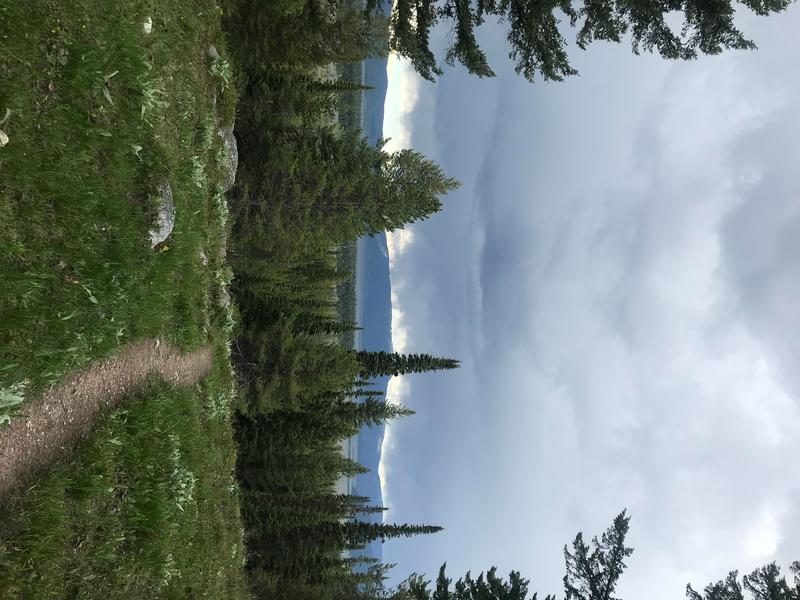
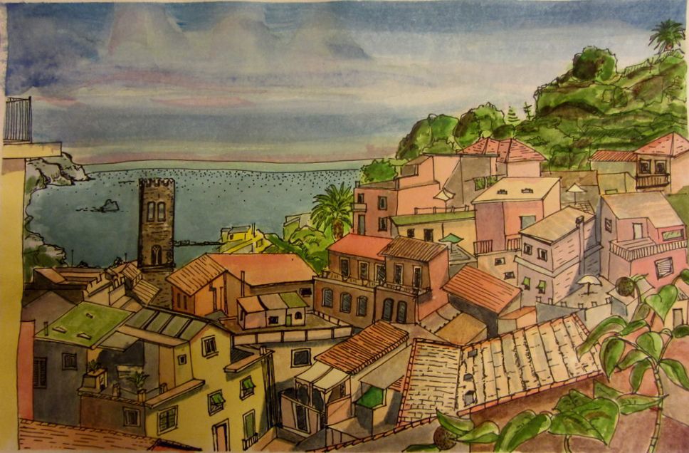 End of Semester project. Creating an Original Landscape Watercolor Painting *Description/Objective: I will create an original watercolor painting from a resource photo by first reproducing it then revising it to reflect my own style. Strand/Standard: Standard 7–8.V.P.3: Develop skills and concepts to refine artistic work for presentation by analyzing and evaluating methods for preparing and presenting art based on criteria, by collaboratively preparing and presenting selected theme-based artwork for display, and by formulating exhibition narratives for the viewer. Standard 6.V.CR.2: Formulate an artistic investigation of personally relevant content for creating art. *E.Q.: How do artist create work that is both imitational, formal, and expressive Materials/ Resources: Photo resource of a familiar landscape to our geography that has an obvious foreground, middle ground , and background in high resolution. 2 printed copies one in black and white and one in color. pencils that can create a range of values Watercolors a variety of watercolor brushes 6 x 9 drawing paper 2) 6x9 watercolor paper 1) 9x12 watercolor paper **Vocabulary: Imitational, formal, expressive, revise, personally relevant, pre-assessment Sequence of Instructions Students will demonstrate their retention of learned art skills in watercolor painting in this final project. They will.... 1. Create an original composition using more than one source material and combining them into an original detailed shaded drawing. 2. Use the skills that we learned of perspective, how to create the illusion of depth, use of blending and glazing to create lights (warm) and shades (cool), how to work large to small, light to dark. 3. Students are expected to utilize the skills learned! Do not tackle unfamiliar subjects or techniques. That includes A. well formed trees that follow the rules of perspective and have a consistent light source, B.buildings that are in also in perspective, C. mountains that have the appropriate amount of detail, value and color based on their location in the picture plane. D. Skies that have clouds that are blended, shaped accurately, and sized in perspective, and E. A consistent overall light source with drop shadows and highlights. Before we complete the grading on this assignment, students will do a pre-assessment using the rubric below, revisit their work, and then submit for final grade.
To paint still water is to create an illusion.In a landscape, water is often suggested by reflections, a patch of light in the middle of , a dark landscape, a dark flat stripe at the base of a mountain range, or a touch of blue in the middle of a green field might suggest a river. The essential characteristic is that it reflects. Either the sky or the landscape upside down. But if you paint it perfectly, it doesn't indicate the movement that we expect to see in water. With the principal reflection being that of the sky, it is essential when depicting calme water to master your gradated washes.Use a large soft brush, larger pans for mixing color as plenty of water is key. Lighter weight papers buckle allowing paint to puddle, and some paints granulate and trap in the texture of the paper, so practise is important. Practise the following wash 2-3 times on draft paper, then choose one on which to do the mountain range reflection. Then do a final draft wash on WC paper, draw in the sketch without the reflections, and paint step by step. Light to dark, big to small, moving around the surface to work in dry areas, glazing layers of color over dry paint. * I used sgraffito to scratch in white tree trunks into wet paint. Rubric: Painting Still Water Criteria: On time, followed directions, care for materials, clean up, on task Skills: clean evenly gradated background wash. worked in areas of dry paint (no wet to wet or blooms) contrast: of warm colors in light areas and cool colors in shadows values and intensity: lessen to indicate depth in middle and back ground Brushwork: brush size appropriate to amount of detail.
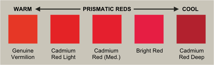
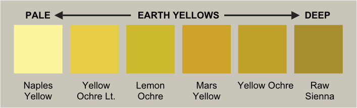
In our watercolor techniques, we learned how to lift color to create the illusion of white fluffy clouds, but not all clouds look like that. Often they are filled with color and are a value much darker than pure white. In this video, the artist shows us how o mix cerulean blue, alizaron crimson,and naples yellow. Look at the examples below. The red is very cool toward magenta, the blue is warm toward turquoise, and the yellow is subtle not intense sore of the color of natural pine wood.
Now we'll try painting sky and mountains. Here is the sketch you will start from. This will be the ultimate grading rubric 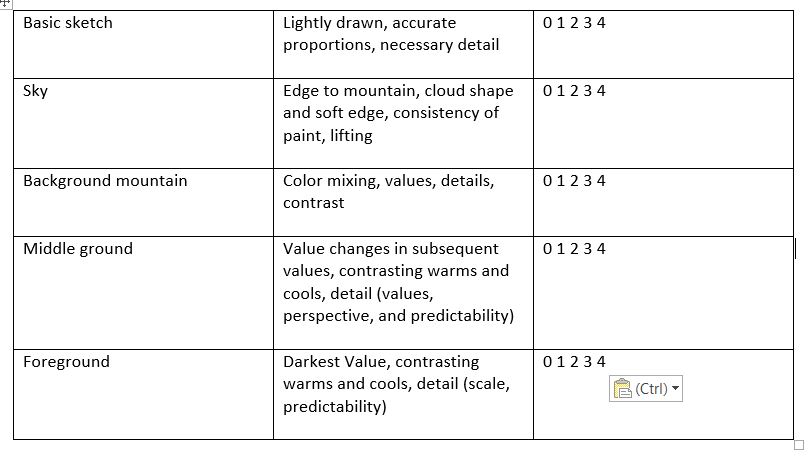 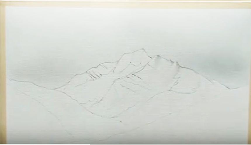 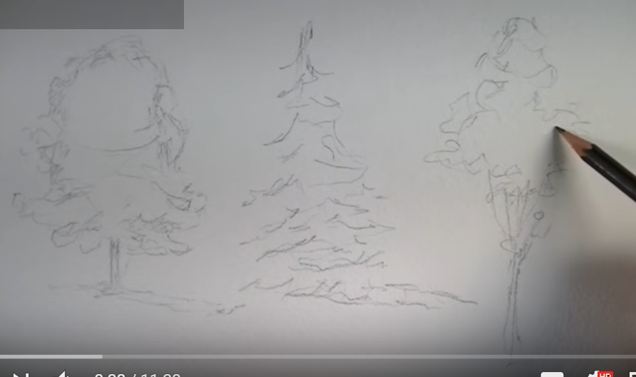 Again with half sheets of paper, we will practice creating a light source and texture in three types of trees. Start with a sketch like this... The grading rubric for this exercise will be based on this criteria: Grading rubric for watercolor trees, 28 points possible: total _____ 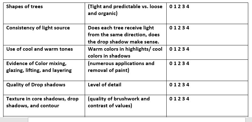
|
AuthorWrite something about yourself. No need to be fancy, just an overview. Archives
November 2018
Categories |
||||||||||||
|
|


 RSS Feed
