After viewing the structure of the eye, move on to how to draw a realistic looking eye.
|
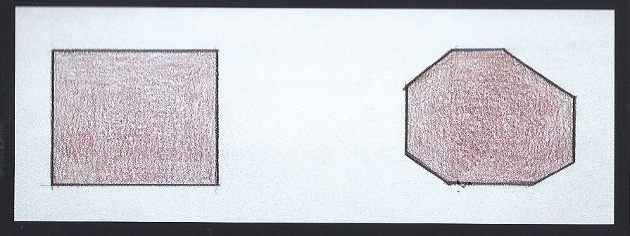
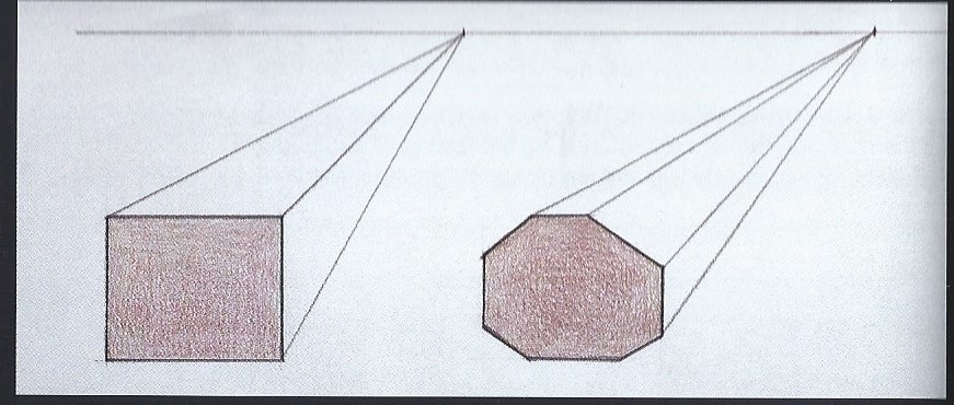
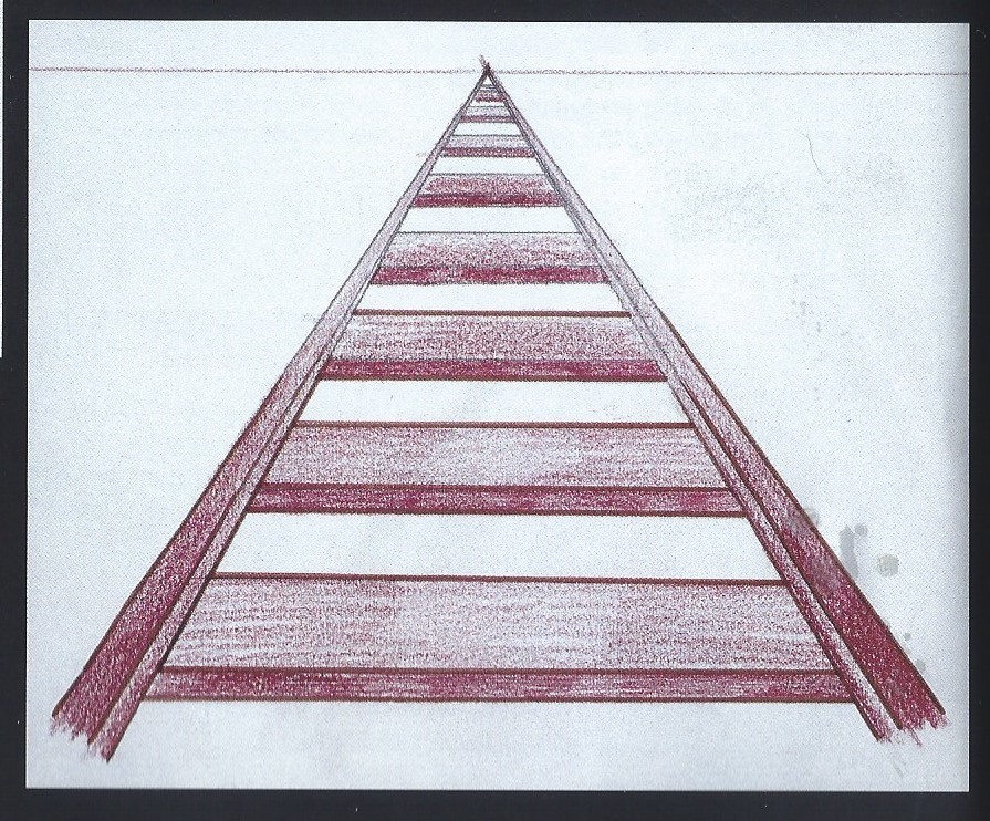
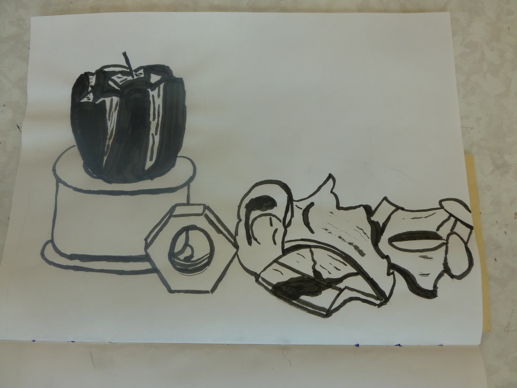
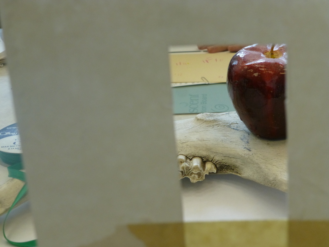
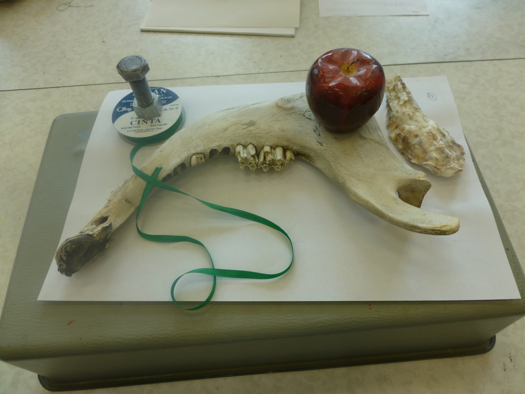
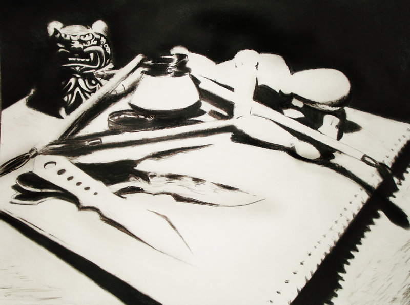
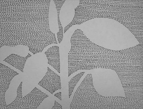
After you have done the facial proportions, and the structure of the head, you will move on to the structure of the eye. This video is extremely generic. It does not account for individual proportional differences, nor does it teach you how to draw the specific features of the face. Follow this tutorial and include the text that indicates the placement of the features of a face. Since it is impossible to flatten objects onto the surface of the paper, artists had to create a system that could simplify spatial relationships and find ways to make it look right. In the early 15th century in Florence Italy, an architect, Leon Battista Alberti and the sculptor Filippo Brunelleschi, simultaneously demonstrated that space could be described mathematically to recreate the feeling of depth on a flat surface (2 dimensional picture plane). The system quickly became a success because, when put into practice, it produced a result that looked like what the eye was seeing. It mimicked the way that the eye sees space and objects in daily life. Although perspective is an extraordinary tool, it is not an exact science, often geometric measurements do not always coincide with the real model. After viewing the power point on Perspective as a Tool for Drawing, copy the following one point perspective illustrations from the image gallery into your sketchbook.  For this assignment, students will make a contour drawing from a still life using a view finder to crop the still life to the proportions of their 9 x 12 paper. They will then analyze the cropped image to identify values. If the values are darker than 50% black/white, then they will be painted black. If they are lighter, they will remain white, thereby creating a high contrast image. Here are the steps... 1. create a still life with dark and light objects 2. Make a viewfinder by cutting a 1 1/2" x 2" square hole out of a piece of card stock. 3. hold the viewfinder up to the still life to crop the image. Then draw what you see through the viewfinder to the full size of your paper. (see image) 4. Using ink and a brush, paint the areas that are darker than half gray totally black and leave the lighter areas than half gray, white. Ribbons, spheres, crumpled paper, etc.Students will create a still life out of various objects around the room and create four different compositions from this still life. 1- a gesture drawing (charcoal pencil), 2-a positive negative space composition (patterning the negative space with felt tip pen), 3-an accurately shaded still life (pencil) , After doing the three exercises using your still life, You are going to do three drawings using one still life object (not a photograph) of your choice (school appropriate, of course) in each of these three techniques. Try to make these an example of your best work and we will share them in class. 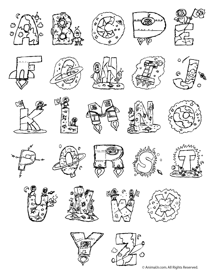 Our first assignment is to create a name card that uses drawing to do the following
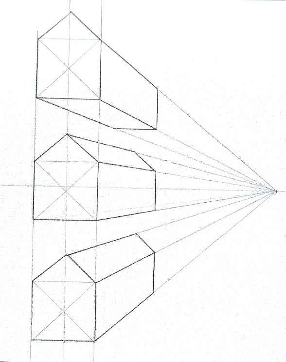
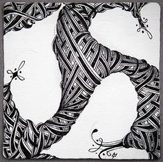
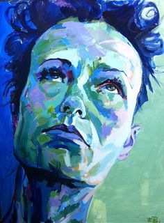
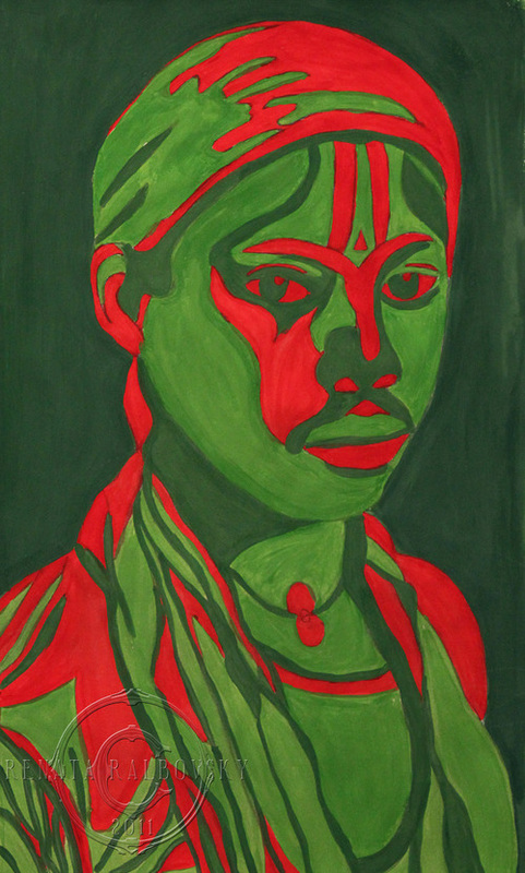
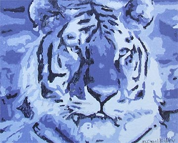
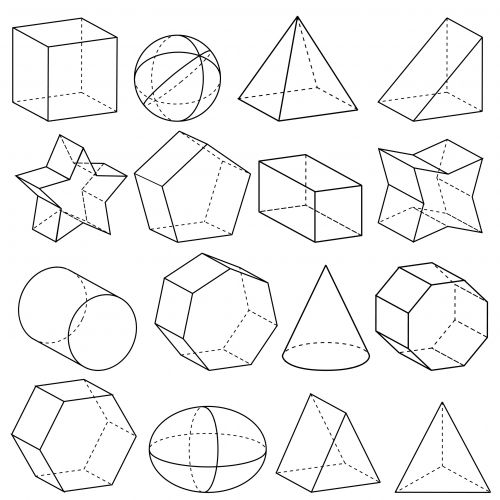
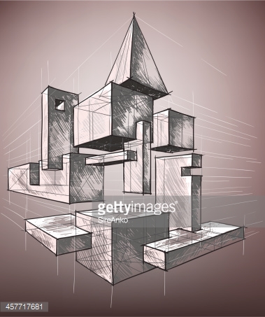
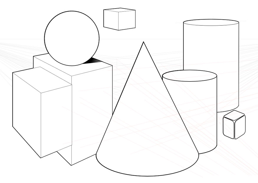
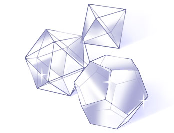
1. Fills the space on the paper given with your readable name. 2. uses a theme to connect each letter as a drawing. 3. The theme in the drawing should have something to do with you These are the CRITERIA of the assignment. (30 points) Next your will be evaluating each other's work based on the CRAFTSMANSHIP and CREATIVITY of the card itself. We will determine the qualities of each of these categories for this assignment, then we will do a sticky note critique based on each category. (30 points) After viewing the video on "How to See in Value". You will work from a still life or photograph, and reduce it down to 4 basic values. After copying it 3 times onto separate sheets of paper, you will use three of the five color schemes to represent the various values. (Refer to the description of the basic color schemes from the "Exploring Color" power point.) In general, drawing that use equal amounts of each color often become too balanced and static (balance). Make your preliminary sketches on the drawing with the color media you are using. Remember that even though you may only be using one to 4 hues, you will be using a variety of values and intensities of those tones. 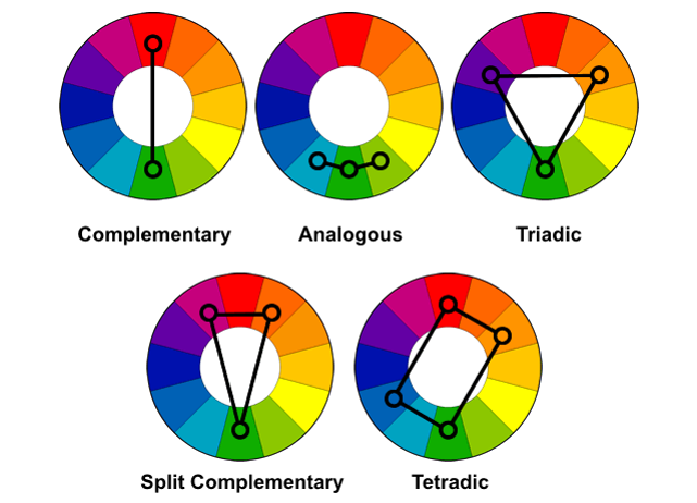 Draw some complex geometric forms in two point perspective that overlap and interconnect. This should look like an architectural design that fills the page so that the negative spaces around your construction are also interesting shapes. Somewhere within these forms...
|
AuthorDonna Pence: visual Art Teacher, East High School Archives
October 2018
Categories |


 RSS Feed
